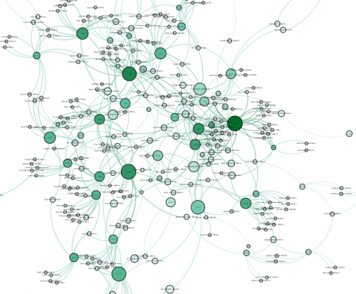
Take a look our visualization of the network of researchers in the Scottish Government’s Strategic Research Programme (SRP) as an illustration of just how complicated things can get! The image shows the complex connections between the researchers involved in the SRP (the bigger the node or circle - the bigger the level of interaction and lines represent linkages).
The SRP is a vast programme of research involving the work of hundreds of researchers across a variety of topics such as Natural Assets, Productive and Sustainable Land Management and Rural Economies, and Food, Health and Wellbeing. Recognising the complexity involved we began developing a directory of expertise where we hope to make the linkages between the science and scientists much easier to navigate for us all. Hopefully this kind of information will become more readily accessible on the SEFARI web-site next year, but until then a little more information can also be found in the project’s blog.
The Directory of Expertise is only one example of visualising complex data we and our colleagues regularly deal with though. There are actually many teams working across SEFARI on ways to communicate a variety of complex data, and we recognized we all could benefit by sharing our knowledge and practice more widely. Therefore, we decided to apply to the SEFARI Responsive Opportunity Fund to create a collaborative community in this important area, and we were delighted that our idea to develop a workshop on ‘Imaginative Tools for Visualizing Complexity’ was awarded funding in September 2017.
The Responsive Opportunity Fund is designed to support new and collaborative knowledge exchange ideas which enhance impact and add value. Projects need to be inter-disciplinary, cross-institutional, show creativity and demonstrate how they will improve the communication of our work.
The workshop has the goals of:
- establishing a network - enabling people from across SEFARI to get to know each other’s work better,
- exposing participants to new approaches and tools to visualizing data,
- providing an opportunity to have a go at using the approaches and tools,
- and increasing awareness of diversity and accessibility issues when preparing visualizations.
Whether the data are challenging to visualize and communicate, or whether there are methods and approaches to visualization in a particular area of research that could be used more widely, then this network is designed to help and our ideas are already gaining interest both within and external to SEFARI.
The workshop is planned for 6th February 2018 with guest speakers Sophie Warnes (Office for National Statistics) and Prof Jessie Kennedy (Edinburgh Napier University) and we’ll be sure to blog again later to let you know how the event went, but in the meantime and for more specific information about this activity please follow our project blog.
Dr Gary Polhill & Dr Paul Shaw (The James Hutton Institute), Dr Mike Spencer & Joshua Bird (Scotland’s Rural College), Bram Boskamp (Biomathematics & Statistics Scotland).